The colors of a Moroccan spice market + AURA Color Stories
Greetings, color aficionados worldwide!
Happy New Year 2020 to all of you. Here at LFB Color, I’m delighted to announce my business expansion into international territory with a new catchphrase, “Coloring my way around the globe.”
The plan is to share colorful imagery, palettes developed with those images in mind, and of course some upcoming color consulting projects as I finalize them. My intention from the jump was to become an international color consultant, and I’m finally able to do that now at this life stage.
This week’s inspiration comes from the richly colored world of Moroccan spice markets, and this particular image I spotted on LFB Color's Pinterest Page earlier today.
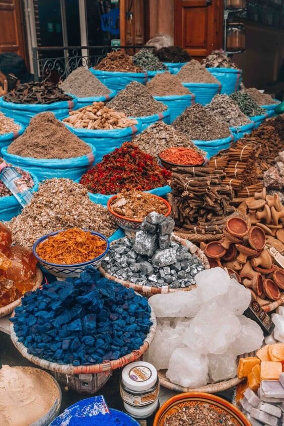
PHOTO SOURCE: Ibiza Hobo Girl
Here is the corresponding paint color palette I selected from Benjamin Moore’s most artistic collection, the AURA Color Stories.
CSP-335 French Macaroon—an ivory that serves as the lightest neutral in the palette
CSP-1060 From The Archives—a warm tan which I would probably use as the main paint color
CSP-1050 Hope Chest—a brown that is not too deep, and that coordinates well with the anchor hues of red and yellow
CSP-1145 Tomato Tango—the anchor color which inspired me most in the palette
CSP-960 Goldsmith—an earthy gold with tones of green to evoke the spice market “feel”
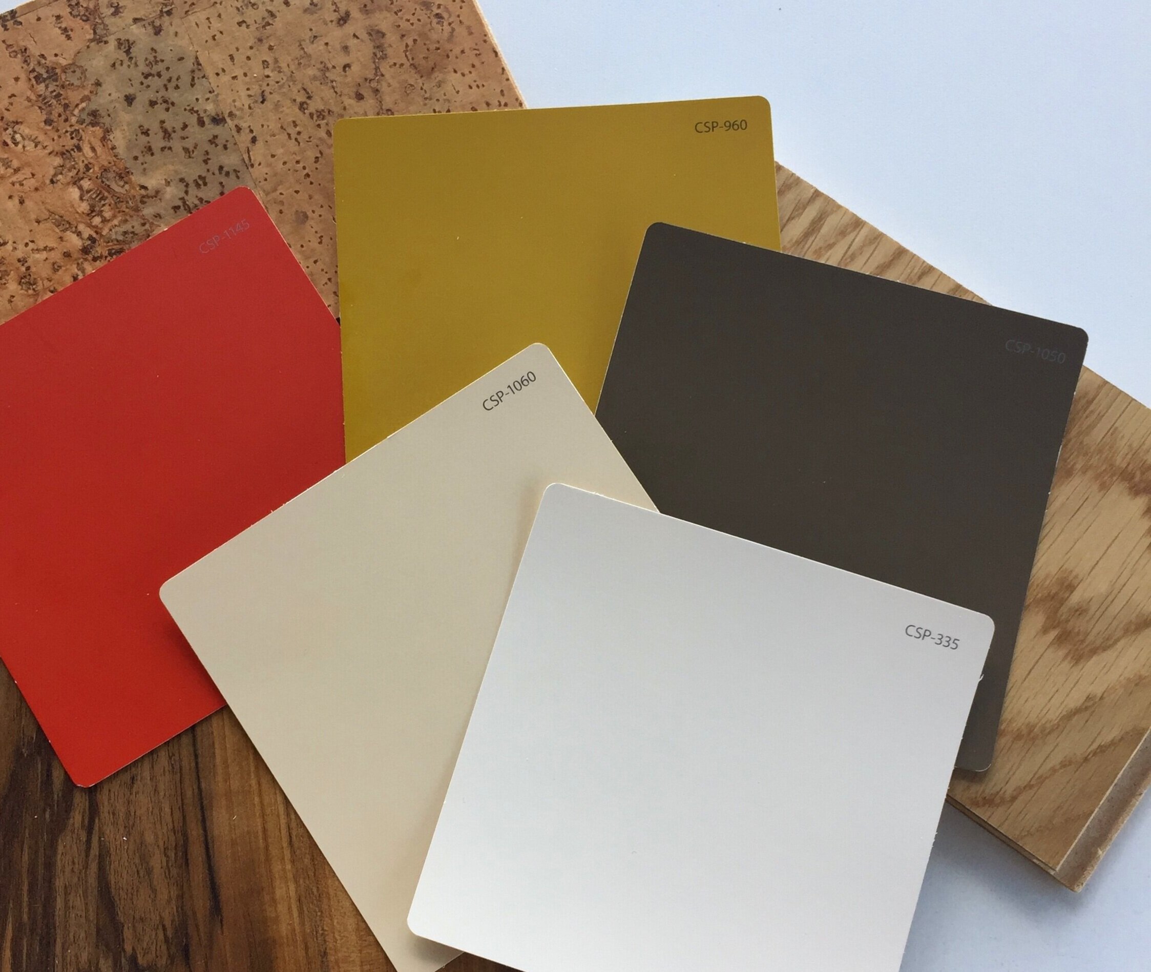
I like to provide alternatives to white in home decor, because a stark white doesn’t usually harmonize with earthy colors. You’ll note above that I provided an off-white and a light tan. The lighter of the two, CSP-335 French Macaroon, can be used for trims, doors and cabinetry in a home. The tan CSP-1060 From The Archives, is what I would use as the main wall color. Both the red CSP-1145 Tomato Tango and the gold CSP-960 Goldsmith can be used as accent walls, and of course in decor and furniture pieces.
PHOTO SOURCE: Pinterest

PHOTO SOURCE: Ashly Rugs

PHOTO SOURCE: Ashly Rugs

PHOTO SOURCE: Pinterest @TFDesign
The AURA Color Stories paint collection from Benjamin Moore is a palette I use when working on higher end projects honestly. The colors are formulated especially using only pure color pigments, and no gray or black. To create just one color, 5-7 individual pigments are used, creating what Benjamin Moore calls “nuanced color that responds to different lighting conditions.”
Prior to joining forces with my client SRH Paint Co, a Benjamin Moore supplier with three locations here in Houston, Texas, I knew nothing about paint. To me, all paint was the same and I just bought the cheapest product I could find.
Part of what I also want to do here on the blog is educate my audience on paint and why it is worth your money to invest in the best product. I’ve learned a lot since partnering with SRH and Benjamin Moore.
DISCLAIMER:
This is a promotional post and I am being compensated to write about SRH Paint Co and Benjamin Moore products. The opinions, however, expressed here in this blog are my own. I’m not a fan of pushy sales copy type of blogging. My job as I see it is to explain WHY I back these products and HOW I use them.
With that in mind, let’s chat about the AURA paint product itself. As one of Benjamin Moore’s higher end paints, it delivers superior results. I recommend to clients the AURA product for bathrooms and high moisture areas, as there is a mildew-resistant component to the paint. For those spaces, I recommend specifically the AURA Bath & Spa product.
I also recommend the AURA product for studios, libraries, formal dining rooms, and then for exterior doors in the AURA Grand Entrance product.
The AURA paint line offers extreme hide, spatter-free application, excellent flow and leveling, as well as a smooth surface. For those new to the paint world, I’m providing you with a Mini Glossary of Paint Terms below to better understand the terms used here.
HIDING POWER: The ability of a paint to hide the previous surface or color.
FLOW: The ability of a coating to level out and spread into a smooth film, paints that have a good flow usually level out uniformly and exhibit few brush or roller marks.
LEVELING: Ability of a film to flow out free from ripples, pockmarks and brush marks after application.

PHOTO SOURCE: Architectural Digest
The bottom line with paint is that it is worth investing in high quality products that save time (the AURA product applies smoothly and quickly) and money (colors don’t fade easily, touch-ups are a breeze, and you can easily remove wall stains and marks without wearing down the paint).
I leave you with this color tip:
When selecting paint colors, use 1 -2 colors as neutrals, then bring in 1-2 accent colors per room. I personally like to use the same 1-2 neutrals throughout the home, then change accent colors in each room.
If you have an open plan home without doors to separate rooms, then I recommend selecting 1-2 accent colors only for the entire home. It maintains flow and consistency in the whole space.
Okay, friends. Make it a colorful week!
Until next time,
your color correspondent Lauren
