MEDIA
13 Vintage Colors That Are Trending Again — And We Can See Why
Lauren was featured in Southern Living magazine with her take on vintage colors and pairings that are making a comeback in 2025.
CLICK THE IMAGE TO READ FULL ARTICLE!
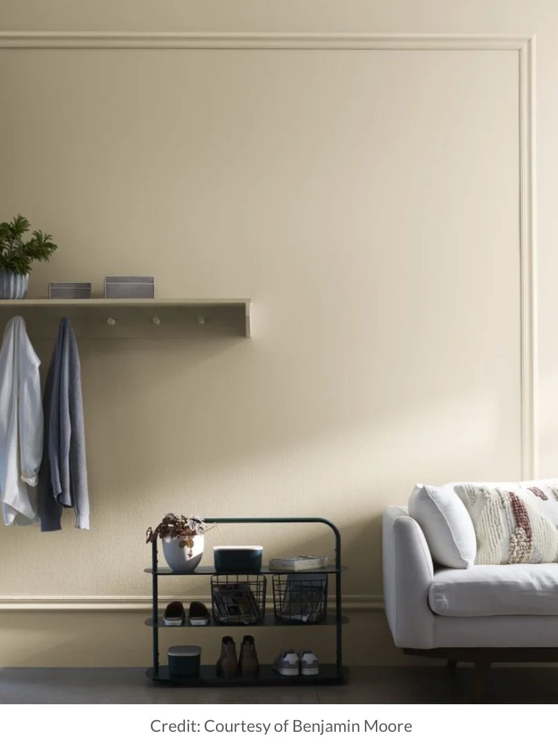
What Color Is Indigo? Turns Out There’s Some Heated Debate Around This In-Between Shade
In this hotly debated topic centered around the enigmatic hue indigo, Lauren shares that “Indigo is a stronger, more pigmented alternative to the navy blue decor trend for those who want to pack more punch in their décor choices.”
CLICK THE IMAGE TO READ FULL ARTICLE!
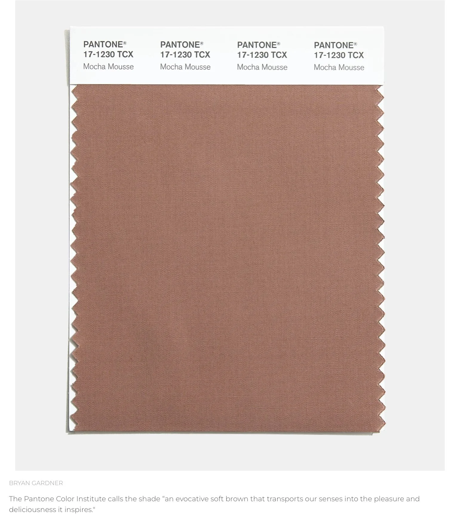
Huffington Post interviewed Lauren Battistini on her opinion of the 2025 PANTONE Color of The Year—Mocha Mousse.
“A neutral such as Mocha Mousse doesn’t necessarily hold much presence on its own, but when you pair it with the right colors, it serves as a visual comfort within the overall color palette,” she said.
“I see it as a perfect anchoring neutral to combine with colors such as cream, aqua, ochre, warm red, aubergine, blush, cinnamon and warm greens.”
CLICK THE IMAGE TO READ FULL ARTICLE!
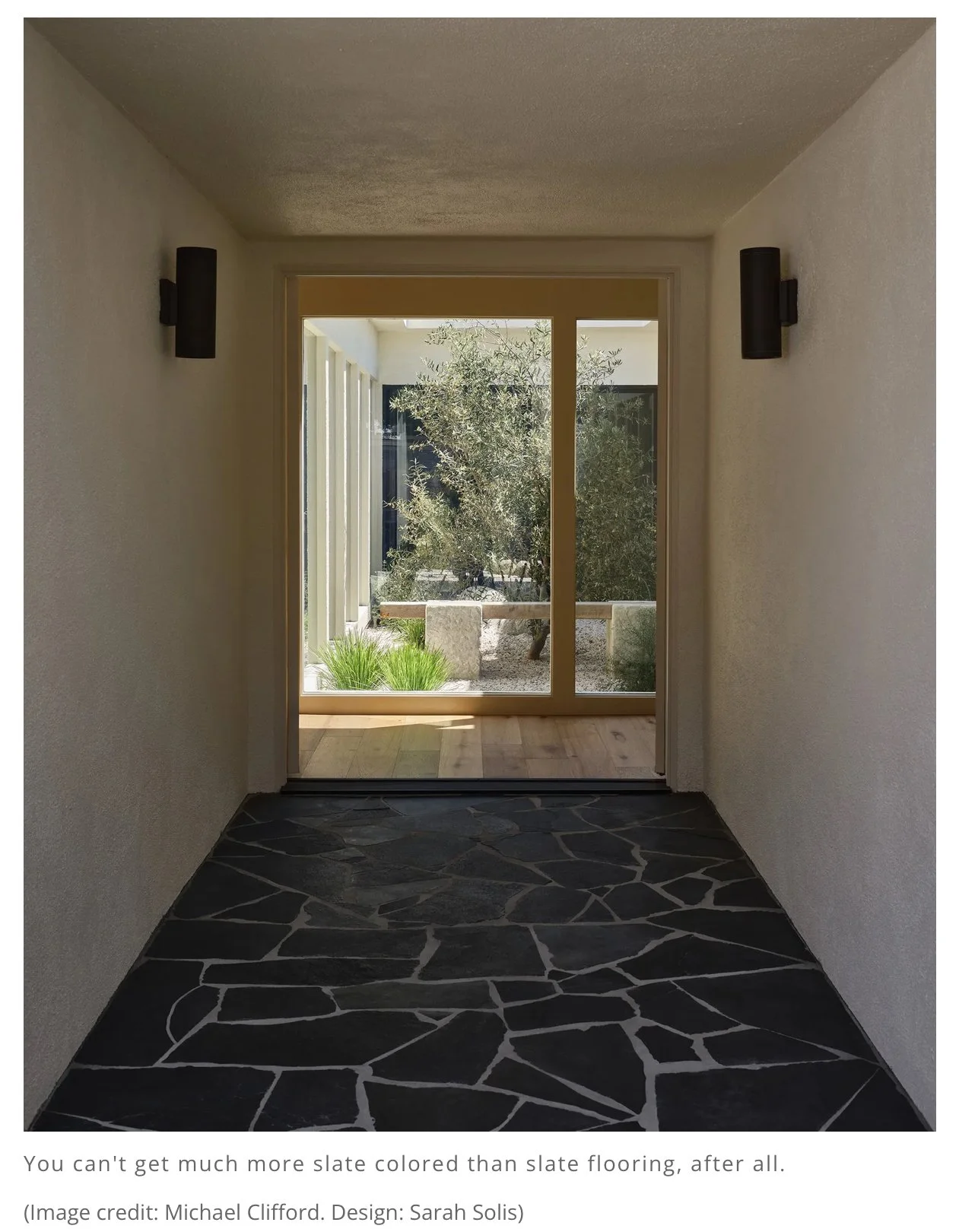
Livingetc magazine UK asked Lauren once again to deliberate over the color slate and how to work it into almost any decor scheme.
“When it comes to colors that go with gray in this slate tone, the perfect complements are warmer colors like burnt orange and terracotta, balancing them with its cool blue undertones.”
But Lauren Battistini warns to be careful with how you use it in your home, adding: "With the global shift in neutrals from the cooler grays of years past to the cognacs, soft browns, and overall warm neutrals today, I believe that slate as a gray décor color is going to be used more sparingly, especially because it is such a cool, blue-gray."
CLICK THE IMAGE TO READ FULL ARTICLE!
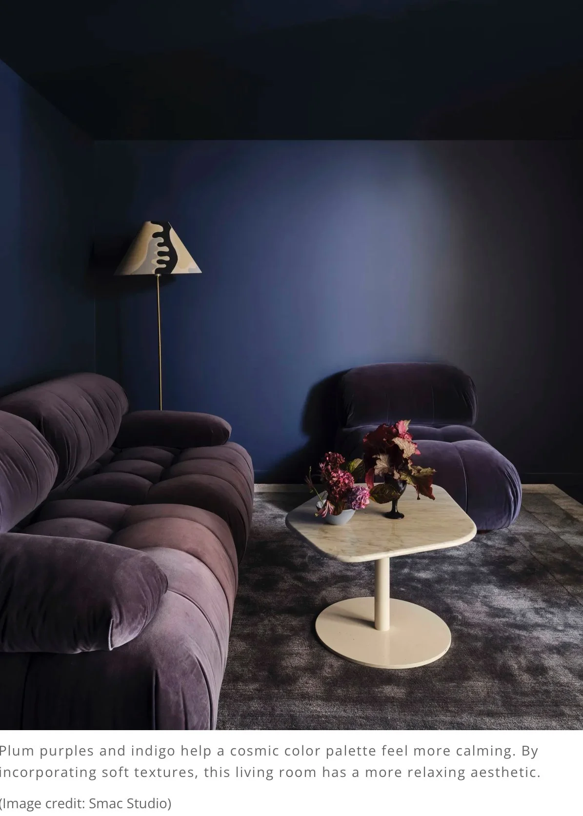
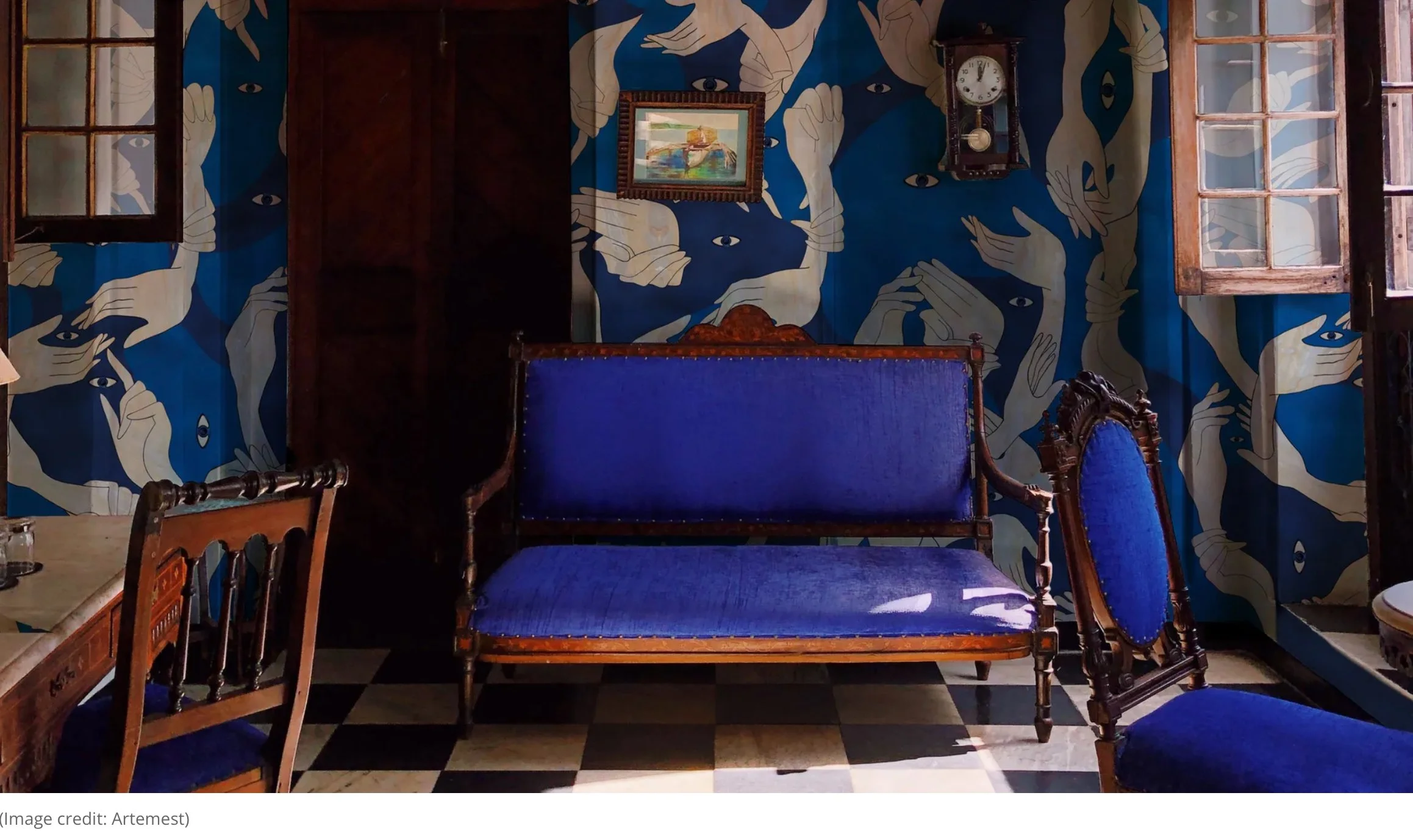
This ‘Cosmic' Color Palette Is the Decorating Trend You Should Be Doing Right Now If You Like Dark, Moody Rooms
Livingetc magazine asked Lauren to elaborate on the definition of a cosmic color palette and how to seamlessly incorporate into your architectural space.
So, what are they? "The cosmic color palette is one containing a predominance of deep, cool purple, indigo, and blue with balancing accents of luminous off-white, lilac, the lightest of periwinkle tones, and a pop of orange-tinged yellow," Houston-based color expert, Lauren Battistini, tells me. "The deepest anchoring neutral would be a charcoal verging on black."
These color palettes are full of deep, moody saturations, but don't let that be a reason to shy away from them. "There is a gentle, relaxing quality about the cosmic palette when used in home interiors," Lauren assures me. And I'd argue that a full immersion into this cool color trend is the best approach to understand its strength and potential. In other words, it's time to step out of your comfort zone and into the cosmos.
CLICK THE IMAGE TO READ FULL ARTICLE!
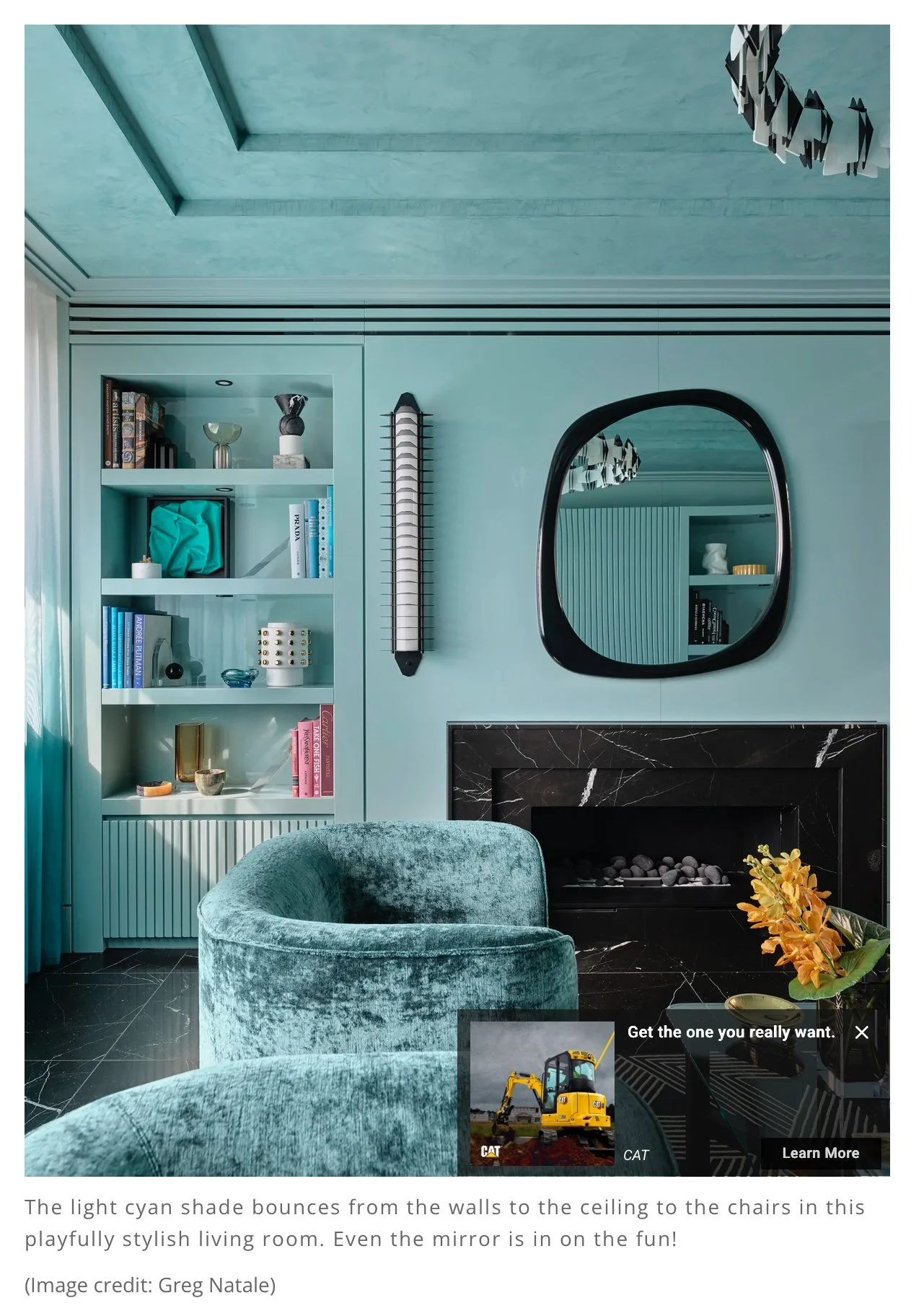
There Is Something So "Ethereal" About the Color Cyan — Designers Break Down Why That Is, and How to Use It
A well-styled home is all about the little accents. Lauren Battistini, a color expert and chief color strategist at LFB Color Consulting, says, "In a home decor scenario, I incorporate tones of cyan sparingly and pair them with blues and greens to achieve a harmonious, less contrasting palette."
Turquoise ceramic pieces and artwork featuring this tone provide the perfect measure of this luminous hue. Cyan is a playful and serene counterpart to monochrome or neutral color schemes, but remember that "little dose goes a long way," adds Lauren.
CLICK THE IMAGE TO READ FULL ARTICLE!
LFB Speaks with Great Day Houston about picking out fun fall colors for your home!
LFB Talks to Great Day Houston about picking exterior patio furnishings!
LFB Color talks to Great Day Houston about FIVE ways to pick perfect paint colors for your home!
Support Creative Soles Podcast: LIVE LIFE IN COLOR
Neiman Marcus Fashion Show with Click 2 Houston
Neiman Marcus Must Haves Event & Fashion Show : Color Consultant Lauren Battistini
“For more than a decade, Lauren Battistini has worked with me as an on-air expert in color consulting. She’s one of the best in her trade and continuously provides viewers with takeaway information that empowers them to shop and wear the colors that are not only in-style but will work for their complexion. I still receive comments about her “Color of the Season” stories, as well as one of our most popular stories from 2009: “The Right White for You”. Women, especially brides, loved learning about their most flattering shade of white! In addition, because she is such an organized professional, she’s always made my job as a TV Host, Reporter, and Producer easier and more enjoyable.
—Rebecca Spera, TV host, reporter, producer”