Scared of color? 3 ways to try your hand at the colorful minimalism trend
When you want to add color to your home but fear it and don’t know where to begin, “colorful minimalism” might be your best design bet. With these 3 easy tips, you can become a stylish color embracer without breaking the bank or overcommitting with that magenta colored couch you saw one time on Pinterest. Haha!
Choose ONE bold color and use it throughout your home in different ways and small doses.
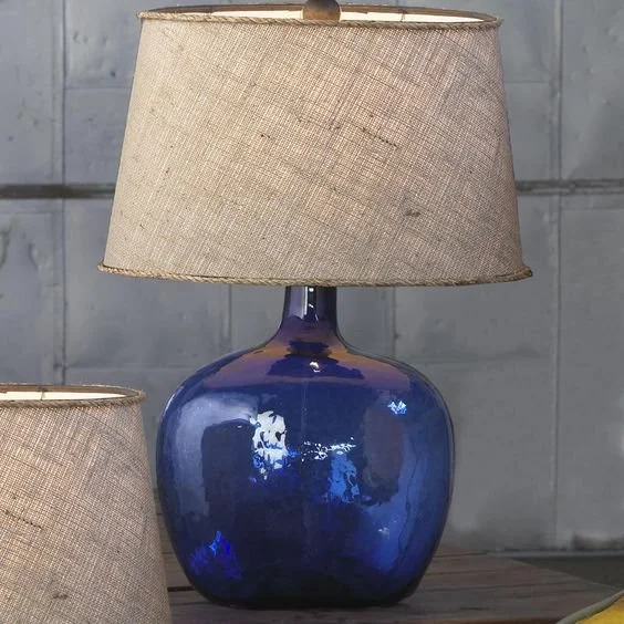
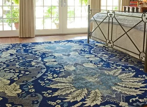
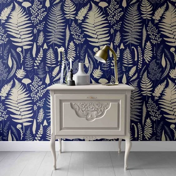
Let’s take the example of cobalt blue. That’s a bold move no doubt, but I’m here to prompt you to explore new color frontiers. In one room, you can place the area rug and lamp. In another room you can install wallpaper, and in yet another room you can use patterned fabric for curtains and throw pillows.

Remember that a little bit of color goes a long way, and you can always change it up over the next few years if you decide to.
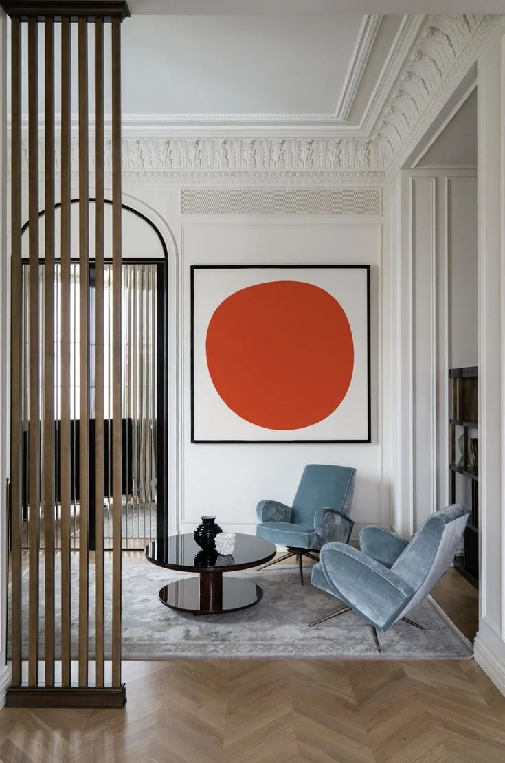

PRO TIP: If you’re scared of color and are experimenting, then I recommend spending as little as possible at first, and only on accents that are NOT permanent elements. For example, please don’t invest in cobalt blue back splash in your kitchen UNLESS you are fully committed and have always loved that color!
2. Experiment with sheen, texture and plant life to create the effect of pops of color.
Let me tell you one of the most fascinating things about sheen. It completely changes the appearance of a color by illuminating it to seem more vibrant and saturated. Using high lacquer on neutrals such as black, beige or white creates a brightening effect that translates in some ways as “color” to the human eye.
I highly recommend this option for those of you who are really too frightened of color. This at least achieves a brightening effect in any space. PRO TIP: I learned years ago from my best color mentor Leatrice Eiseman that white translates as a color when used in home decor because of its strength and vibrancy. I hadn’t thought of it as anything but a neutral before.


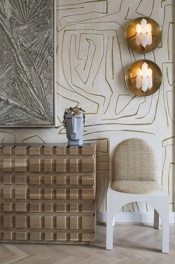
Another way to create the illusion of color is to add texture and a mixture of different neutral tones. Color is seen and understood in context, and that is always based on whatever it surrounds. This means that if you have warm, orange tinged wood furniture in front of an orange-beige wall, it will all blend in and just look like warm wood. If you put that same warm, orange tinged wood furniture and place it in front of a white wall, then it appears much more orange.
Let’s not forget plant life. Can you keep plants alive, though? That’s a topic for another day, isn’t it? Bringing plants indoors and using them as decor statements will always impart a touch of effortless color. Green has visual and physiological benefits, as well. FYI. You can google the phrase ‘color psychology’ for details.

3. Look at neutrals differently. I’ve got 3 mini-takeaways for you here. Read on!
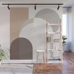
Mini point 1: Can’t neutrals be “colors”? Yes, they kind of can when you mix three or four of them together.. Bring in 1 little pop of actual color to finish it off. You’re still staying true to your minimalist selves!
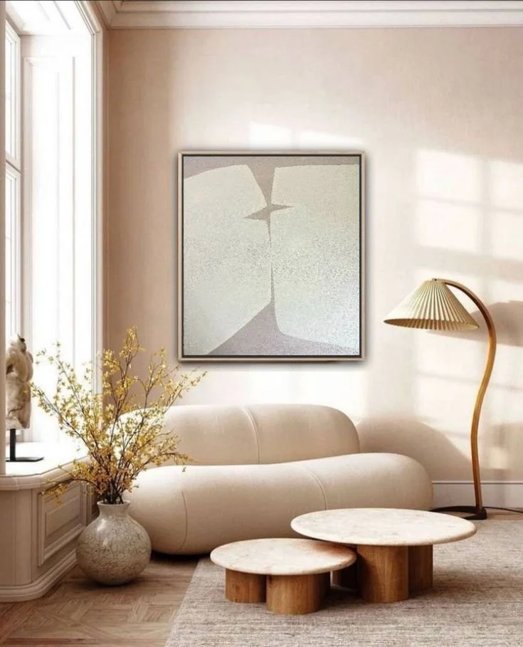
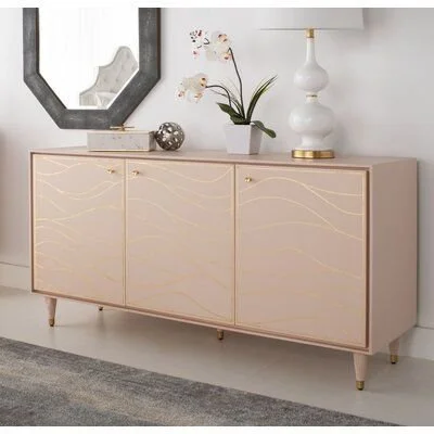
Mini point 2: Play up the undertones in neutrals and use those as your pop of color. Let’s look at two examples below with pink beige. Essentially, soft pink will become your color to complement the pink-beige walls.
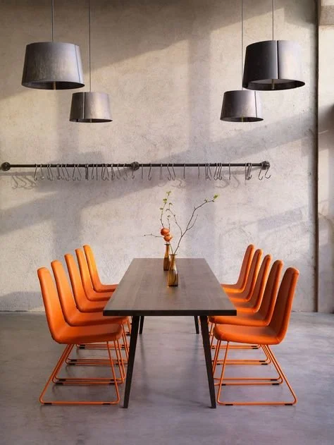
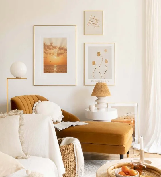
Mini point 3: Let’s flip the script on what we define as neutral. Why not make a color a neutral by using it in enough spots in a room? See the example below where enough use of this pumpkin color is at play to make it look like a neutral along with white.
In summary, you can be a minimalist and curate color judiciously for your home.
We discussed the use of a singular focal color throughout your interior, experimentation with sheen, texture and plant life, and finally how to rethink neutrals.
As always, please comment below with any questions or feedback. I’d love to turn your questions into blog posts.
Until next time,
your color gal Lauren