Lauren's Take On 2019 Pantone Home + Interiors Color Report
Good morning, friends!
Yesterday I sat in on Pantone's webinar detailing 2019 home + interior design and color tips. It is my pleasure to break down what I learned and share some of my color ideas with you.
As much as I DO love reading trend reports and seeing what's coming down the pipeline in color and design, I confess to not really following trends. In the end, I do what I want and embrace the colors that resonate with me on any given day!
NOTE: Many of the beautifully curated images you see below are screenshots of the Pantone webinar and are thus to be credited to www.pantone.com accordingly.
Here are some common themes presented in the area of design for 2019:
mixing various styles to create a unique aesthetic
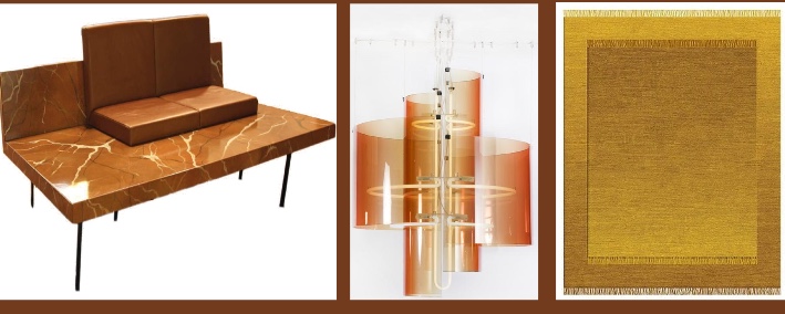
'70s revival with modernized geometric shapes and sleek use of those earthy '70s colors
soft textures and shapes in furnishings
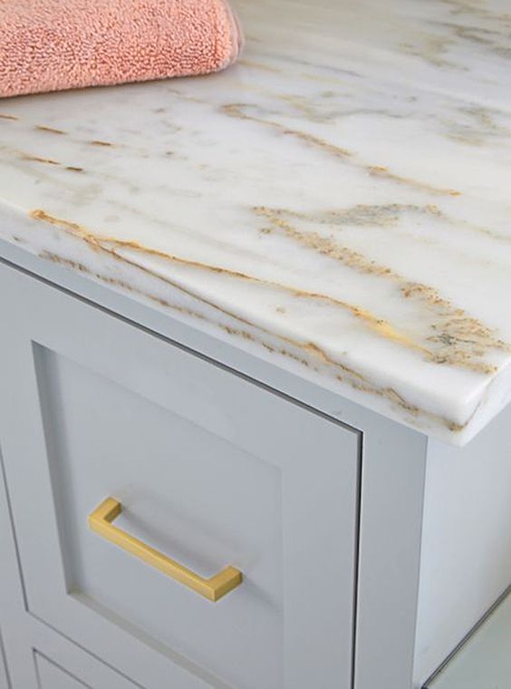
metallics: mixing + matching, composite metallics, metallicized color surfaces, mixture of high + low sheen
neutrals still on trend as non-committal colors to which you can add bold color accents
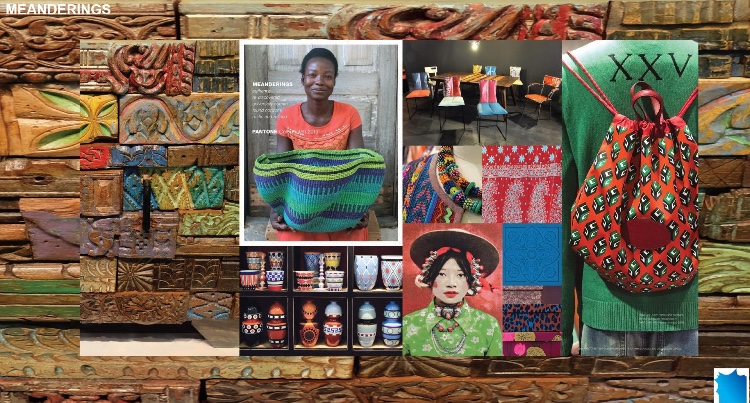
hand crafted pieces with an artisanal look
iridescent and oxidized finishes
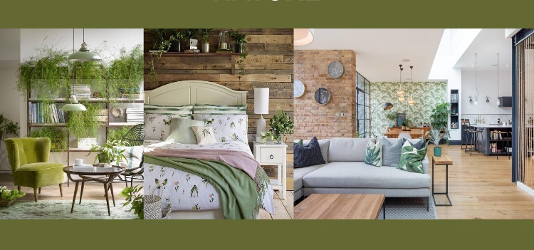
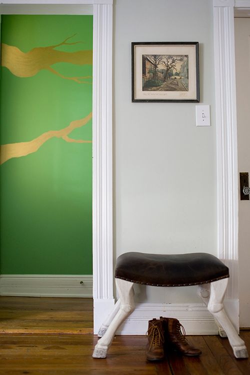
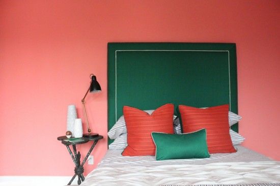
nature inspired with tons of green hues and a focus on sustainability

Since I am all about color, I want to share some trend information from yesterday's call, along with some of my color palette recommendations for home interiors. What I notice most about 2019 color palettes are the interesting mixes, abundance of options, subtle and bold hues sharing stage, and an emphasis on a full range of greens.
My color picks from PANTONE's various color stories for 2019 are included below. I specified Benjamin Moore paint colors, and all codes are provided below. If you are in Houston and need further help selecting paint or decor colors for your home, then please do reach out to me at lauren@lfbcolor.com.
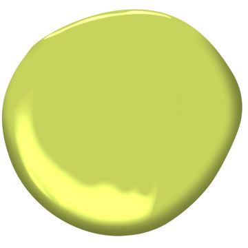
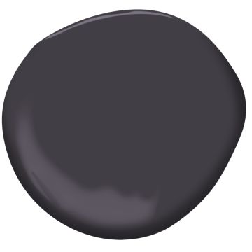
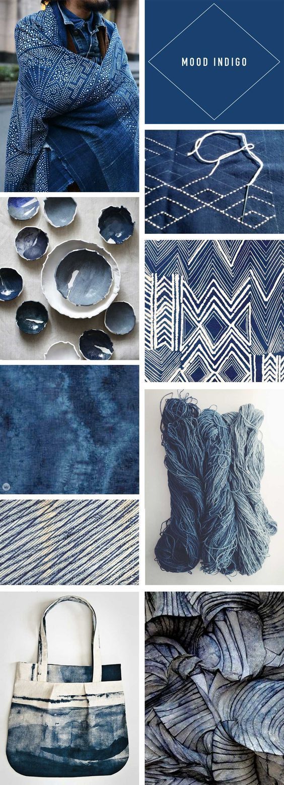
My first color picks are inspired by PANTONE's color story MUSINGS. Colors chosen are Antique Coral (1198), Mediterranean Breeze (799), Aurora Borealis (565), Electric Slide (404), Galaxy (2117-20), and Mystical Grape (2071-30). I personally would choose Electric Lime and Mystical Grape as accent colors.

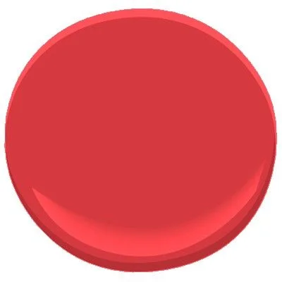
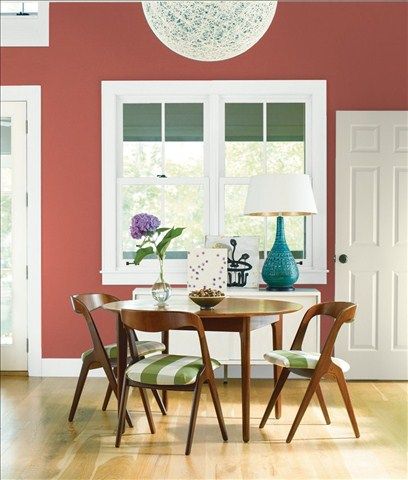
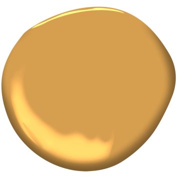
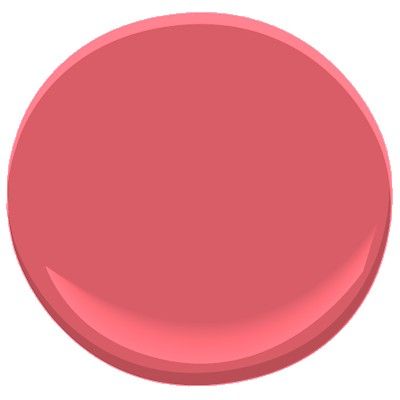
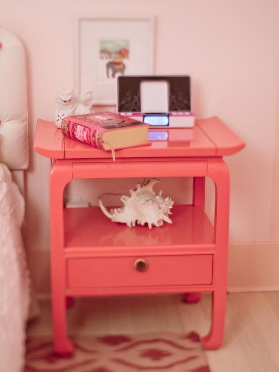
Next up we have my color picks inspired by PANTONE's color story called CRAVINGS. My corresponding Benjamin Moore picks are below as follows: Warm Sienna (1203), Crushed Berries (2076-30), All-a-Blaze (1304), Crushed Velvet (2076-10), Bonfire (2001-20) and Peony (2079-30).
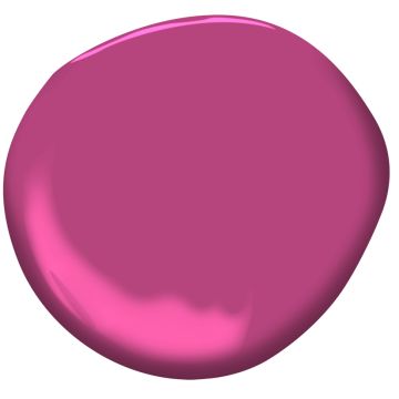
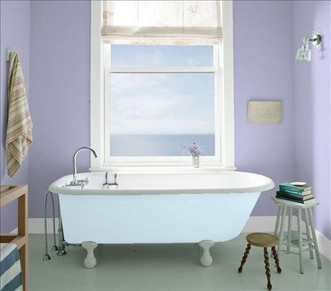
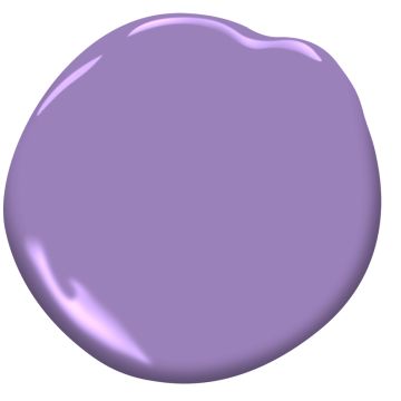
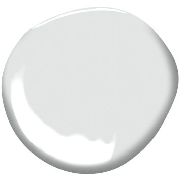
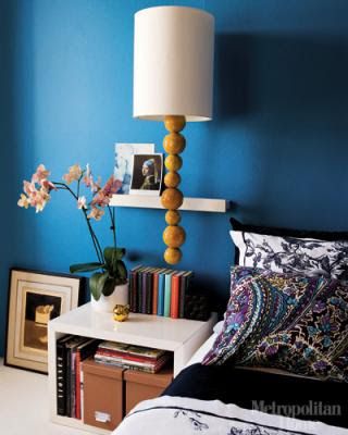
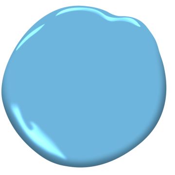
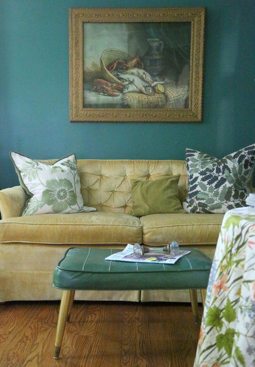
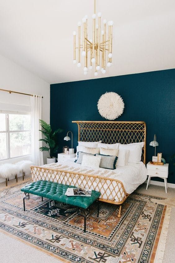
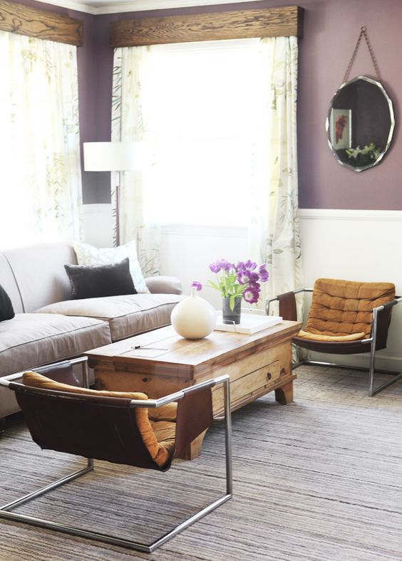
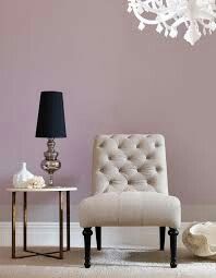
A third PANTONE 2019 color theme is PROXIMITY. I am a fan of this palette because of its cool, gentle feel. All of the colors are very calming and versatile for home decor. My Benjamin Moore paint picks are as follows and in this order: Central Mauve (1412), Crocus Petal Purple (2071-40), Genesis White (2134-70), Paddington Blue (791), Sea to Shining Sea (789), and Steamed Spinach (643). All photos were found on Benjamin Moore's website or Pinterest with the exception of the image of Steamed Spinach (PHOTO CREDIT: www.thedecorologist.com).
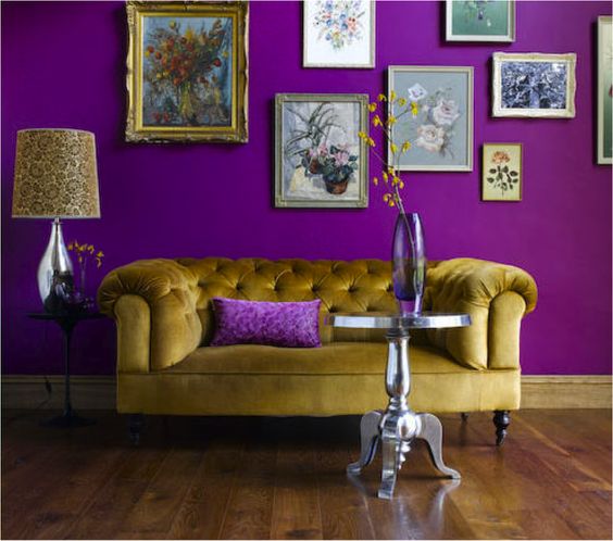
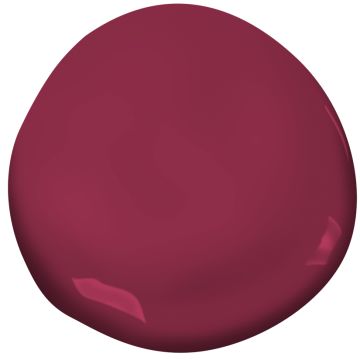
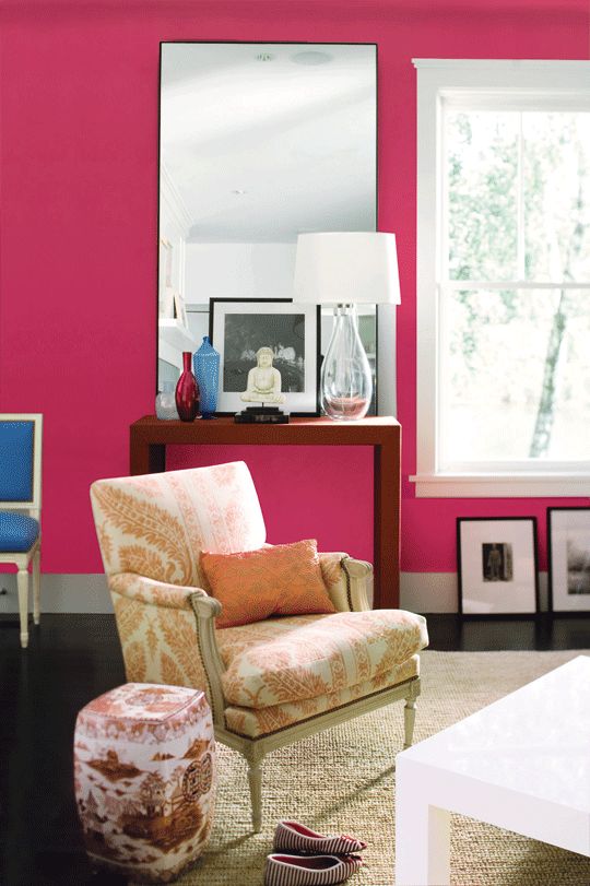
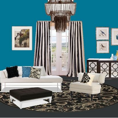
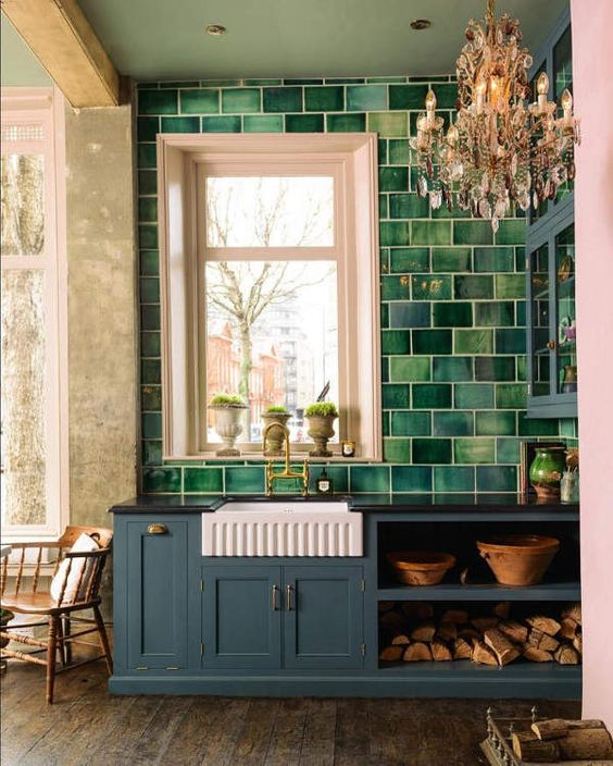
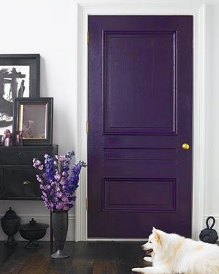
A fourth PANTONE 2019 color story is called PARADOXICAL. I am all about it. It is the most bohemian of palettes for home interior in my opinion. My Benjamin Moore picks are as follows and in this order: Americana (770), Glowing Umber (182), Hidden Sapphire (CSP-690), Milano Red (1313), Purple Heart (1406), and Southern Belle (819). Photos are all from Pinterest with the exception of Southern Belle featured by www.thinkmakeshareblog.com.
If you know me at all, you know that I do not like to conform to strict sets of color rules. I am not the color police. I am the color REBEL. Let's have fun with these 2019 interior colors and create one stand out hybrid color story. Here are my picks for 2019. We can just call this palette, "Pantone, you're not my daddy and you can't tell me what to do." LOL. These are the six colors I would use to refresh my home in 2019. FYI, white does translate as a color in home furnishings, as it is quite bold and strong to the eye. Colors: Central Mauve (1412), All-a-Blaze (1304), Warm Sienna (1203), Genesis White (2134-70), Aurora Borealis (565), and Galaxy (2117-20).
That sums it up, folks. Please reach out if you have any questions for me, or if there is another color topic you'd like me to cover over the upcoming weeks.
As always, thank you for your readership.
xoxo,
Lauren