Mixing cool and warm elements in architectural spaces
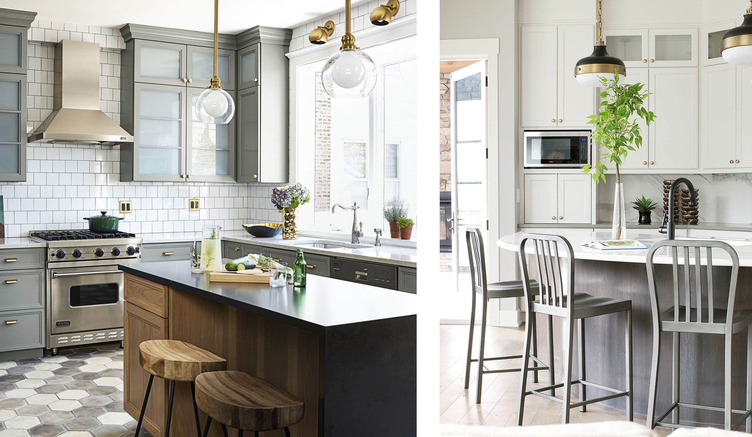
IMAGE ABOVE: Kitchen design found on Darci Hether’s site Darci Hether
Greetings, my friends and fellow color enthusiasts!
Today’s topic is mixing cool and warm elements in any architectural space, residential or commercial. I talk a lot about color mixing concepts and “rules,” but please know that there are no hard and fast rules in color and design. I’m not the color police, as all of my clients will hear me say. There are concepts, aesthetic considerations and guidelines to ponder. Here today I will share with you my ideas of how cool and warm colors coordinate best in spaces. I use a lot of imagery found on the public domain known as Pinterest.
In fact, here is the link to the special Pinterest board I made entitled BALANCING COOL & WARM ELEMENTS. All of today’s images are featured there. DISCLAIMER: This is not a sponsored post and I am not being compensated to recommend any particular brands or products.
CONCEPT 1: Understand what we mean by cool versus warm! There are degrees of coolness or warmth in colors. Even yellows can be “cool,” but for today’s conversation we will discuss cools as blues, greens and purples, and warms defined as reds, oranges and yellows. As for neutrals, I classify black, gray, and white as cool and brown, khaki, beige and cream as warm. Here is an example using wood tones below:


VIBRANT COOL (RASPBERRY) AND WARM (YELLOW-ORANGE) PAIR PERFECTLY!
CONCEPT 2: Mixing cool and warm elements can be done with decor such as area rugs, art, throw pillows and blankets. This is the part that to me allows homeowners to be expressive and individualistic with cool art or heirlooms. I’d say that this is the quickest and easiest way to play with the cool-warm mix.


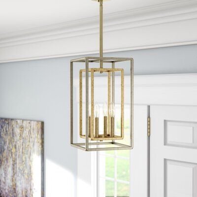
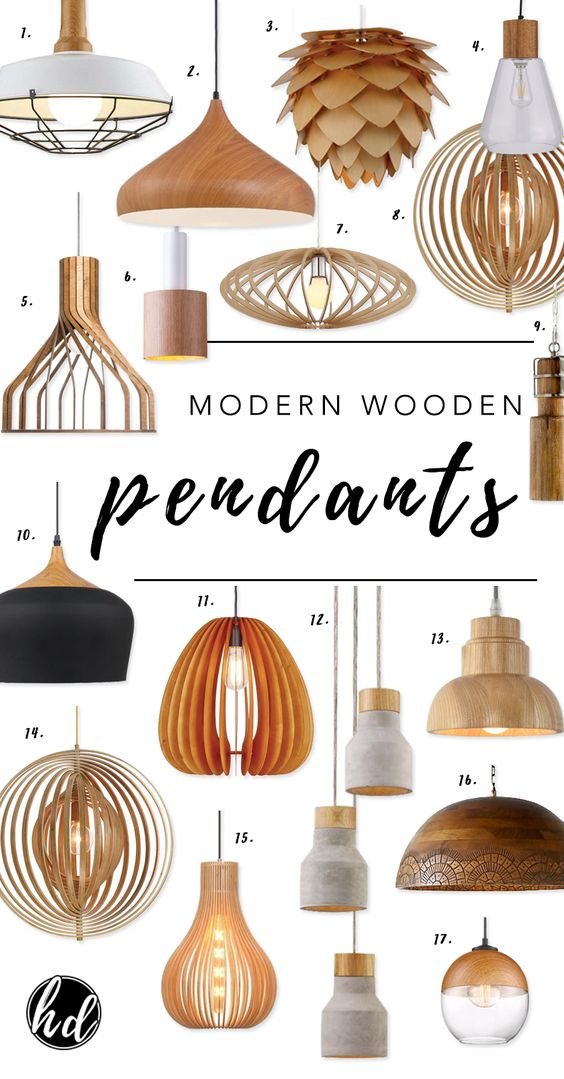
CONCEPT 3: Use statement lighting fixtures as focal points to tell your color mix story. Many lighting fixtures have some combination of cool tones like silver, pewter, or black finishes and warm tones such as gold, bronze, copper, or warm wood. These tones can be incorporated strategically in other areas of the home. We will cover this point next!


CONCEPT 4: There’s an order to selecting finishes and elements, and it matters. Select larger pieces first such as furniture, art installations and lighting fixtures. Look for mixed metals or some interesting wooden lighting. You will determine from there how and where to place the smaller elements and colors into the mix.
CONCEPT 5: Mixing cool and warm color is about balance and repetition. Once you introduce even one new color, metallic or wood tone, you have to duplicate it elsewhere for balance.
Example 1 below shows us on the left that it is a predominantly cool toned kitchen (white backsplash, stainless steel appliances, gray and white floors, and blue gray cabinetry) with hints of warmth (wooden kitchen island, wooden bar stools and gold pendant lighting with gold draw pulls and handles).

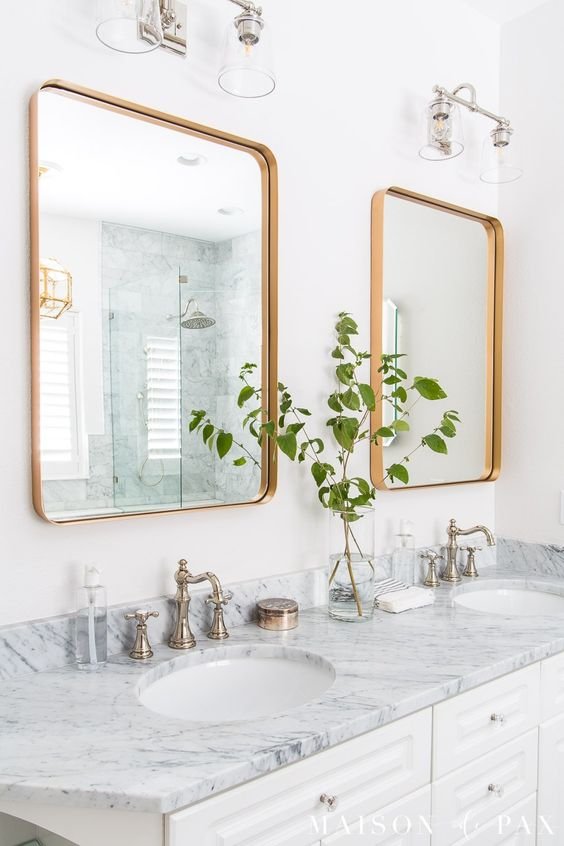
Example 2 below is a simple example of this concept. The bit of warmth brought in is in the dual gold framed vanity mirrors, and notice also in the reflection you’ll see the lighting is encased in gold metal. Everything else is silver and cool toned.
Example 3 below is an example that is quite lovely as is, but where my color eye and preference feel the space calls for a bit more wooden accent for balance. I’d either incorporate wooden tones into the lighting above the table (keeping black tones for a mixed finish effect) and in the fan in the adjacent room, OR I would bring in some warm tones in artwork on the walls.

Mixing cool and warm tones in a home creates balance and rest for the mind, eye and soul in any space. I hope that these tips have helped you. Be sure to reach out REACH LAUREN if I may be of any color, materials and finishes assistance to you on your new build or remodeling project. I’m here to help, friends!
Until next time…….. Lauren #ColoringMyWayAcrossTheGlobe