3 questions to ask when creating a color palette for your home interior
Friends and color aficionados the world over,
You don’t need a course on color theory to create a beautiful palette for your home interior. Did you know that? Anyone can create a color scheme by asking three basic questions.
Let’s get started. Remember: I’m not the color police or your boss. Your home is YOUR home and your color palette needs to reflect your preferences more than anyone else’s. Today I’m merely your color guide. Let’s go!
What is your tolerance for color?
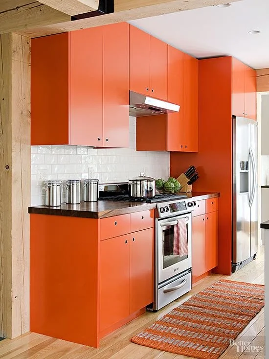
By tolerance I mean your embrace of color and how much of it you like to use in the home. Some people like small touches of color added in accents. Others like very bold choices and lots of them. Determine first your tolerance and preference for color. For example, you would never create a home full of high gloss primary colors if your “eye” truly prefers an earthy, soft, gentle palette. Here’s when going down that rabbit hole of Pinterest for inspiration can actually help you. PRO TIP: Create a Pinterest collection of home interiors that speaks to you somehow, and then look for commonalities among them.
When experimenting with color, look at its three key properties as defined by Albert Munsell, a long deceased but remarkable American painter and art teacher. He developed the Munsell color system, which codifies color three-dimensionally. Truly geeky and fascinating stuff! It’s how I teach color myself.

PHOTO CREDIT: Munsell Color Munsell Color Map
Let’s consider the dimension of HUE. Hue simply refers to the color category on the color wheel. Remember Roy G. Biv? Do you love RED, ORANGE, YELLOW, GREEN, BLUE, INDIGO, or VIOLET | PURPLE? Which are your top TWO to THREE HUES or colors? You build your palette from there!

Basic Color Wheel PHOTO SOURCE: Better Homes and Gardens Better Homes and Gardens
Let’s also look at the dimension of VALUE, or how light or dark you like your colors. Here again, there’s no rule that you must follow.

Blue Color Scale | PHOTO CREDIT: Crayola
A balance of light, medium and dark color is pretty, but so are all light colors or a mixture of light and mid-tone colors. Rarely do I see a space that is all dark, though predominant darkness with touches of light can look refined if enough natural light shines into a space. Check out this design below by Clairz Interior Design as the perfect example of a dark value color scheme. The Garage Blacirum

As you consider your tolerance for color, consider also our last and most important dimension of CHROMA. I talk about chroma all of the time as the saturation, purity or boldness of a color. High chroma colors are at their purest and brightest form, whereas low chroma colors have been muted and toned or “grayed” down. Do you love bold and bright or do you prefer toned down colors? BONUS TIP: Bold colors pair best with other bold colors, while muted colors pair best with other muted colors.
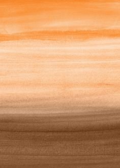
Notice the two orange hues below. The image on the left is a high chroma, extremely vivid orange, while the image on the right is a low chroma, toned down orange. Which of the two appeals more to you?
What colors are already represented in your home in places such as art, furnishings, wall coverings, surfaces and fixed elements?
Unless you are starting from zero with a custom home build and replacement of all furniture and decor, then you are probably keeping much of the art and substantial furniture pieces you’ve curated through the years. The colors and undertones in these pieces will thus become at least part of your overall color scheme.

Tabitha Credenza PHOTO CREDIT: Urban Outfitters
Consider the unchanging or fixed elements in your home. Look at flooring, back splash, counter spaces, lighting and plumbing fixtures. Any new color brought in must coordinate with those tones and undertones. Look at large decor pieces such as art, area rugs and wall coverings. Note large furniture pieces and their upholstery fabric colors and/or wood tones. We have to consider all of this before bringing new color(s) into a space.

PHOTO CREDIT: Studio Mas Creative
ANOTHER BONUS PRO TIP: Take pictures in natural light if possible of these various surfaces and elements. Look at them as a grouping and see what commonalities they have. Save the images in a file on your phone to have when out shopping for more color! YET ANOTHER TIP: Have a white sheet of printer paper on hand to sit next to any surface colors. This helps you to define and interpret the color as it is compared to white. For example, a counter top might appear white perpendicular to a deep brown wood cabinetry, but if you put it next to a pure white sheet of paper it may in fact be cream or off white!
Do you prefer warm or cool neutrals or some combination of both?
I mix warm and cool neutrals all of the time, but that doesn’t mean you have to. See my last blog post here Mixing Cool + Warm Elements for more on that! Let’s discuss what we mean by warm and cool. All color has temperature. Even reds, which are considered warm colors on the color wheel, can be cool when blue is added to them. Below on the left we see a cool red, heading in the direction of purple because some blue was added. On the right we see a warm red, heading toward orange because yellow was added.


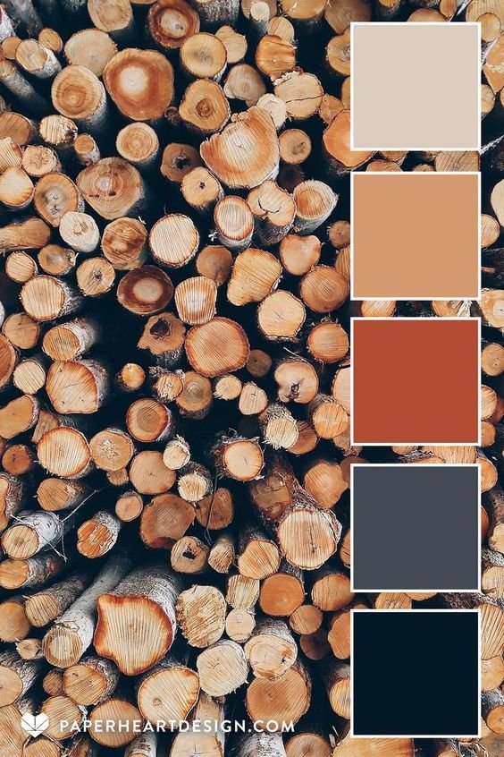
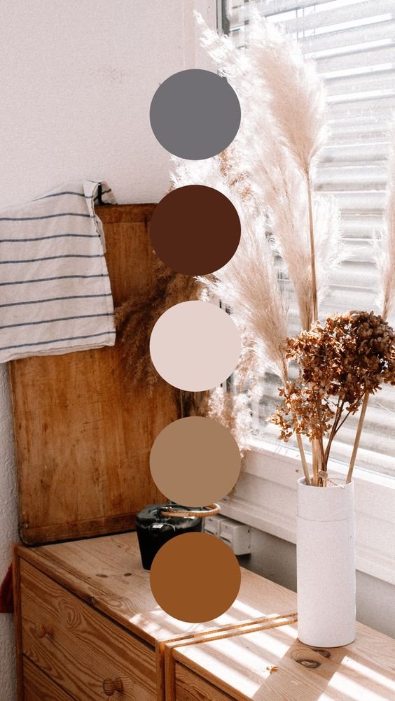
Warm neutrals are cream, beige, khaki and golden-brown. Cool neutrals are white, silver, gray and taupe. We can warm or cool any of these neutrals, but overall brown is known as being warm and black is known as being cool, just as examples. Let’s look at three neutral (mostly) palettes below. On the left we see a cool palette, in the middle we see a mixture of cool and warm tones, and on the right we see a predominantly warm neutral palette. PHOTO SOURCE + CREDIT FOR BELOW IMAGES: 3 Questions To Ask: Interior Color Palettes

Okay, friends, let’s recap. Take a breath. You’ve answered three questions to determine what type of colors you like, what you already have to work with and how you feel about cool versus warm neutrals. This combined with a paint color fan deck should help you to experiment with combinations and create a palette for your home interior.
Because I know that color choices can be challenging, I’m very keen to read your comments and questions following this post. Please post them for me. I will be sure to answer each and every comment or question to the best of my ability.
Try to answer the questions I posed above, but then do comment if and when you’re stuck on something. I’m here to teach you how to make color work for you!
Your color gal Lauren